Balancing the benefits of people, place, and tech.
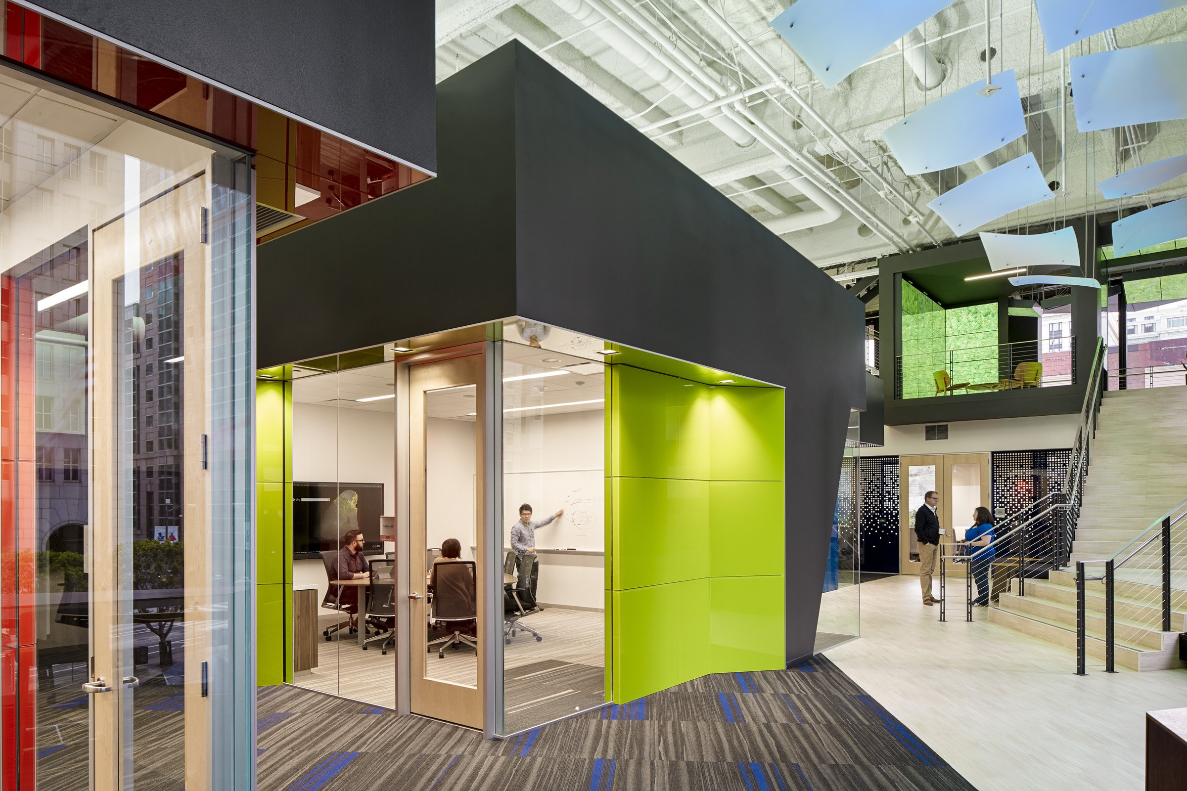
As a global leader in productivity technology, Microsoft looked to its new San Francisco office as a showroom for innovation and discovery with a balance of people, place, and technology.
Built using Microsoft’s global design guidelines, the new office seamlessly integrates mobile technology to allow people to work anyplace, anytime. Its products become the vehicle for how people move through the space both guiding and driving the user experience.
MICROSOFT
LOCATION
San Francisco, California
SIZE
43,500 SF
SCOPE
Architecture
Interior Design
Furniture Design
Lighting Design
PHOTOGRAPHY
Bruce Damonte
AWARDS
Interior Design Magazine
Best of Year Honoree, 2015
Interior Design Magazine
Make It Work Award, 2016
The suspended ceiling panel sails lead visitors to an interactive second-story brand landing in the middle of the office’s internal staircase. There, a growing digital moss wall responds to movement using Microsoft’s Kinect technology that displays California poppies and monarch butterflies as people pass. Actual living green walls are also included throughout the space, which offer a tactile contrast to the digital palette and natural points of relief for the human eye.
Although an increasingly mobile workforce means employees do not have to be in the office to work, Microsoft wants to encourage employees to come in. Since work can be performed anywhere, the company sees the workplace as more of a meeting space, where connections and relationships are forged at an eye-to-eye level. It was therefore important to create inviting spaces that would encourage conversation and increase collaboration.
Put your brand at the center of your space’s experience. Get in touch.
Do you love it?
We think you might like these stories too.


